What are the best font pairings for creating premium brand identity?
The best font pairings for premium brands combine classic serif fonts with modern sans-serifs to strike a balance between tradition and innovation. These elegant typeface combinations convey sophistication, credibility, and exclusivity — all essential attributes that elevate your luxury branding and create a powerful visual identity.
TL;DR:
- Font pairings can make or break a premium brand’s perception.
- Combining a serif and a sans-serif creates contrast and hierarchy.
- Elegant typefaces elevate branding and create a cohesive visual identity.
- Examples like Playfair Display + Work Sans or Minerva Modern + Roboto Slab show real-world success.
- Ideal for marketing professionals, designers, and founders building premium brands.
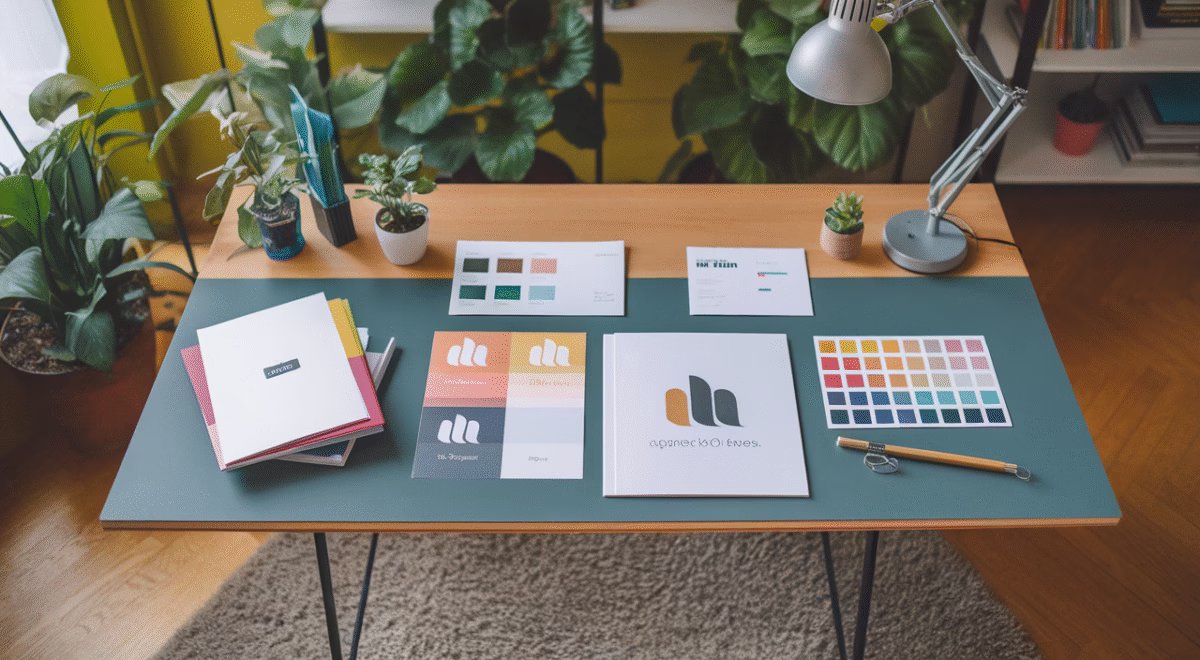
The Power of Typography in Premium Branding
Let’s be honest — your font pairings speak volumes before your message even reaches your audience. Typography acts as the invisible ambassador of your brand’s tone, values, and market position. When building premium brands, the stakes are even higher: one typographic misstep, and you risk appearing generic or losing that coveted luxury appeal.
Think of typography in luxury branding as the couture outfit on your brand’s personality. Just as you wouldn’t wear casual attire to an exclusive gala, using common, overused fonts can significantly undervalue what your premium brand represents.
For high-end visual identity, your typeface combinations must reflect refined aesthetics, uncompromising quality, and timeless elegance. Whether you’re crafting a boutique’s rebrand, designing luxury packaging, or creating a sophisticated web experience, your font pairings will drive emotional connections and build customer trust.
So how do you select font pairings that deliver both style and substance? The secret lies in mastering typographic contrast, ensuring flawless readability, and creating visual harmony — while perfectly capturing your brand’s story and values.
Playfair Display & Work Sans: A Perfect Duo

When it comes to achieving traditional elegance with contemporary sophistication, Playfair Display and Work Sans create an unbeatable combination. This premium pairing delivers balanced visual rhythm that translates beautifully across digital platforms, print materials, and luxury packaging.
Why It Works for Premium Brands
Playfair Display is a high-contrast serif typeface that whispers luxury through its refined strokes and classical European heritage. It conveys deep trust and rich tradition — making it perfect for headlines, premium logos, or packaging that demands gravitas and sophistication.
Work Sans brings clean, geometric precision with exceptional legibility across all devices. It adds a modern, accessible foundation to your visual identity. When paired strategically, these fonts create the perfect balance — classical prestige harmonized with contemporary polish.
Best For
- Luxury skincare or fashion brands
- Editorial platforms or lifestyle blogs
- Premium consultancy services
Poppins & EB Garamond: Finding Balance
At first glance, Poppins (a rounded, contemporary sans-serif) and EB Garamond (a calligraphic old-style serif) might seem like opposites. However, their strategic contrast generates compelling visual storytelling — perfectly blending approachable warmth with distinguished pedigree for premium brands seeking sophisticated accessibility.
Why It Works
EB Garamond carries centuries of typographic history, evoking the craftsmanship of French printing masters. It suggests depth, artisanal quality, and timeless sophistication. Meanwhile, Poppins delivers crisp clarity with letterforms optimized for modern, mobile-first experiences.
This powerful pairing works best when EB Garamond takes center stage in headlines or key brand messages, while Poppins supports with body content and user interface elements.
Best For
- Boutique lifestyle or artisan brands
- Premium online retailers
- Expressive personal brands or consultants
Minerva Modern & Roboto Slab: Timeless Elegance
There’s undeniable charm in font pairings that honor typographic heritage while embracing future-forward design — and that’s precisely what this sophisticated combination delivers to luxury branding.
Why It Works
Minerva Modern is a contemporary serif featuring high contrast and elegantly slender lines, making it exceptional for logo design and brand identity marks. It radiates confidence and drama while maintaining absolute professionalism.
Roboto Slab, a mechanical yet humanist slab serif, provides the perfect complement. It grounds your design with stability and superior readability — particularly valuable in interfaces or content-heavy print applications.
Best For
- Design-forward fashion or jewelry brands
- Fine art galleries and boutique agencies
- Brands seeking dramatic impact with crystal clarity
DM Serif Display: Adding Sophistication

Sometimes, one exceptional font can anchor your entire visual identity when paired strategically within its family. DM Serif Display — a high-contrast typeface inspired by classical Roman letterforms — brings instant luxurious flair to any premium brand application.
Why It Works
DM Serif Display features precisely crafted spacing and delicate curves, making it an outstanding choice for impactful headlines and sophisticated logo treatments. Pair it seamlessly with DM Serif Text for extended reading, or combine with an ultra-readable modern sans like Lato for versatile body copy.
If your luxury branding leans toward classical elegance but operates primarily in digital spaces, this modular pairing expertly bridges historical gravitas with contemporary legibility.
Best For
- Fine dining establishments
- Creative agencies pursuing prestige positioning
- Niche editorial or heritage brands
Cost Guide: Licensing and Budgeting for Premium Fonts
| Font Type | Low-End (Google Fonts) | Mid-Range (One-Time Licenses) | High-End (Custom or Commercial Use) |
|---|---|---|---|
| Google Fonts (Open Source) | $0 | N/A | N/A |
| Professional Fonts (e.g. MyFonts) | N/A | $50 – $200 per family | $300+ |
| Custom Type Design | N/A | N/A | $1,500+ |
Final Thoughts: Choosing Font Pairings for Premium Branding
Exceptional typography requires thoughtful curation and strategic thinking. The best font pairings reflect your brand’s essence — its heritage, vision, and core values — without uttering a single word.
Ever wondered why luxury branding always feels effortlessly refined? It’s not coincidence — it’s precise typographic alignment. By strategically pairing high-contrast serifs with clean, modern sans fonts, you create visual sophistication and a scalable system that works flawlessly — from social media to storefront signage.
As you evaluate or refresh your brand’s visual identity, start by deeply understanding your target audience, brand tone, and competitive positioning. Then apply these proven principles: pair for compelling contrast and clarity, balance rich tradition with contemporary trends, and always test your font pairings in real-world brand applications.
When executed masterfully, your typography doesn’t just communicate — it transforms your brand into something truly memorable. Trustworthy. Distinctive. Elevated.
Frequently Asked Questions
- What makes a good font pairing for a luxury brand?
- A good pairing balances tradition and modernity, uses contrast for hierarchy, and maintains legibility over various platforms.
- Can I use free fonts to build a premium brand?
- Yes, many Google Fonts offer professional quality. The key lies in thoughtful pairing, spacing, and consistent use across your brand application.
- Should my logo use a different font than my body text?
- Often, yes. Logos typically use more expressive typefaces, while body text relies on legibility. The link is established through font families or harmonized contrast.
- How many fonts should I use in my brand identity?
- Two is ideal — one for headers and brand marks, one for body or interface copy. Three can work if styles or cases are well balanced.
- How do I make sure my font choices are scalable?
- Test fonts in various contexts: digital, print, large format. Use responsive font sizes and web-hosted fonts when designing for multi-device branding.
- What are the best tools for experimenting with type pairings?
- Platforms like Google Fonts, Fontjoy, and Figma allow real-time testing for pairings across device types and use cases.
- Can font choices help grow brand trust?
- Absolutely. Fonts affect emotional response, perceived professionalism, and brand memory. Good typography subtly communicates credibility.